Home Color Value: Simple Tips to Pick the Right Shades
Ever walked into a room and felt something was off, even though you liked the paint? Chances are the color value – how light or dark a hue looks – isn’t right for the space. Getting the value right can make a small bedroom feel bigger, a living room feel cozier, or a study feel more focused. Below you’ll find easy steps to match walls, furniture, and accessories without over‑thinking it.
Why Color Value Matters in Every Room
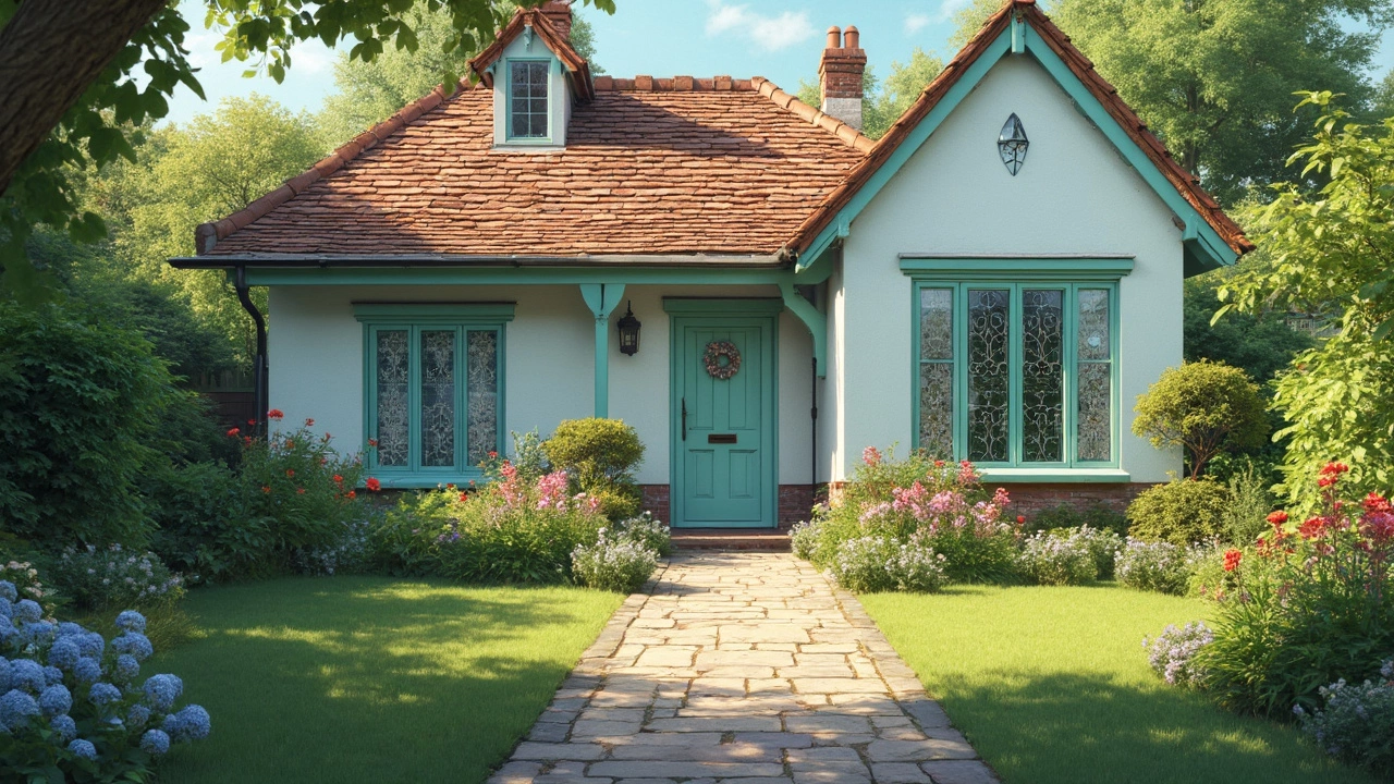
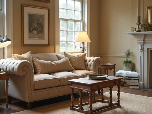
Value is the brightness of a color. Light values open up a room, dark values add drama. When you pick a wall color, think about the amount of natural light you get. A sunny kitchen can handle a richer, deeper tone, while a dim hallway needs a lighter shade to bounce light around.
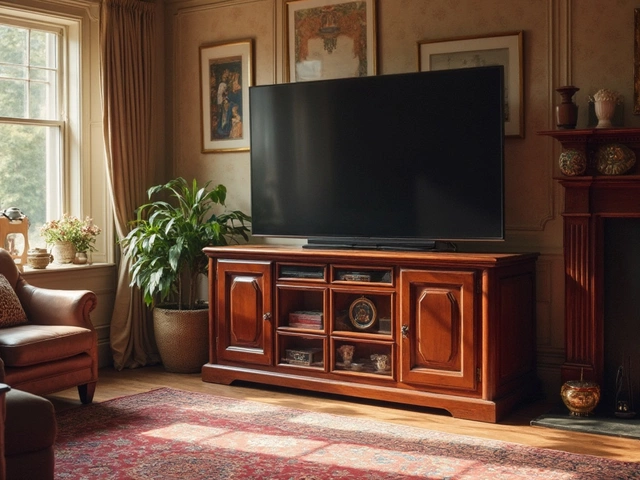
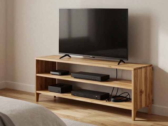
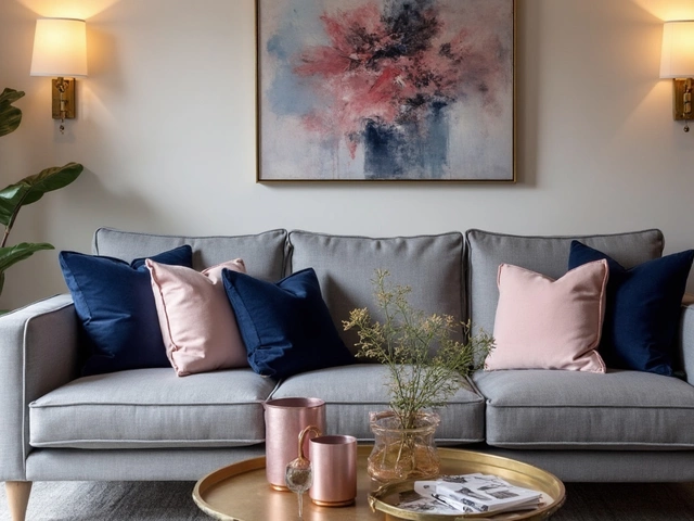
Furniture also plays a big role. A dark sofa on a light wall creates a strong focal point, but the opposite can make the space feel flat. Look at our popular couch color article – the most‑liked shades are neutral mids, because they work with both light and dark walls.
Simple Steps to Find Your Ideal Home Palette
1. Start with a base color you love – it could be a paint chip, a piece of fabric, or even a rug. 2. Test the color in the room at different times of day. Paint a large swatch on the wall and watch how the value shifts with sunlight.
3. Add a contrasting value with accessories. If your walls are light, choose a medium‑tone sofa or chairs. If your walls are dark, balance with lighter cushions, throws, or a light coffee table.
4. Use the 60‑30‑10 rule: 60% of the room’s color should be your dominant shade (usually walls), 30% a secondary shade (furniture), and 10% an accent (art, decor). This keeps the palette from feeling chaotic.
5. Check current trends but don’t follow them blindly. 2024’s top furniture colors are muted greens and warm greys – they pair well with both cool and warm wall values. Pick what feels right for your home, not just what’s popular.
By focusing on color value instead of just hue, you’ll create rooms that feel balanced and inviting. Play with light and dark, match furniture wisely, and enjoy a home that looks put together without a lot of fuss.