2024's Most Stylish Furniture Colors: Trends, Tips & Ideas
Unpack the top trending furniture colors in 2024 with expert-backed tips. Discover modern palettes making waves in New Zealand homes and how to style them for a fresh look.
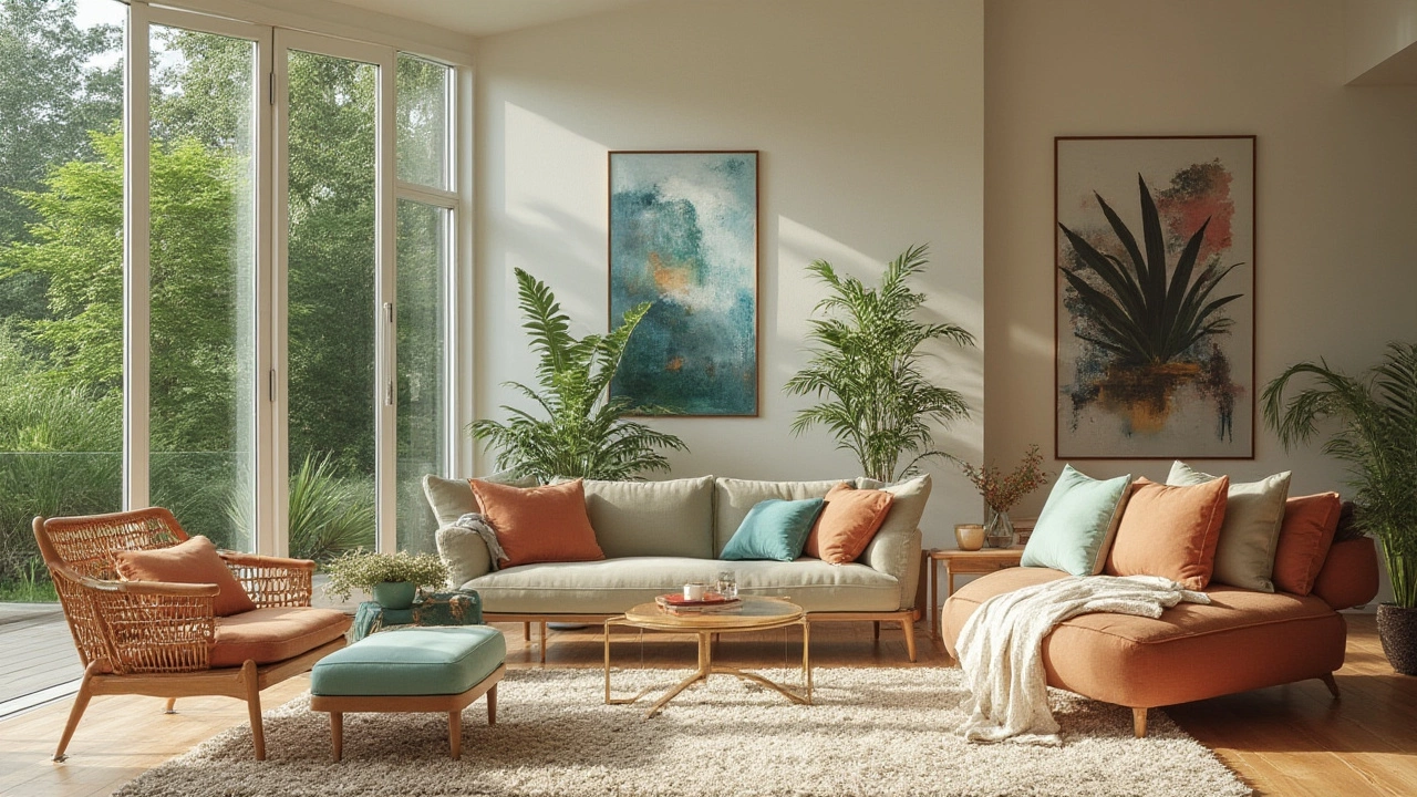
2024 is shaping up to be a bold year for furniture colors. From calming blues in study rooms to vibrant greens in break‑out zones, the palette mixes comfort with a splash of personality. Whether you’re fitting a primary school classroom or refreshing a teacher’s lounge, the right hue can boost focus, lift mood, and hide wear and tear.
Designers are gravitating toward three main families this year:
Nature‑Inspired Greens: Soft sage, olive, and forest tones bring a sense of calm and connect indoor spaces to the outdoors. They work especially well with wooden desks and natural fibre rugs.
Serene Blues: Light sky and muted denim shades are popular in reading corners and science labs because they reduce eye strain and create a cool backdrop for tech.
Warm Neutrals with a Twist: Classic greys and tans now feature subtle undertones of pink, mustard, or terracotta. These hues stay timeless while adding a hint of character that matches a range of accent pieces.
Mixing two of these families in one room—say a sage chair against a blue‑grey table—creates depth without overwhelming students.
Start by looking at the room’s purpose. High‑energy areas like art rooms can handle brighter shades, while quiet zones benefit from muted tones. Next, consider the amount of natural light. Darker colours can feel cozy in bright rooms but may make dim spaces feel cramped.
Don’t forget durability. Fabrics in muted tones hide spills better, while upholstery in lock‑step colors (like deep teal) can stand up to heavy use. If you need a quick refresh, think about swapping chair cushions or desk pads instead of repainting whole pieces.
Finally, test a sample. Paint a small panel on a wall or place a swatch on an existing desk. Live with it for a day—does it still feel right after the morning rush?
By following these steps, you’ll land on a colour that supports learning, looks modern, and lasts through the school year. Ready to give your furniture a 2024 makeover? Start with a single piece and watch the whole room transform.
Unpack the top trending furniture colors in 2024 with expert-backed tips. Discover modern palettes making waves in New Zealand homes and how to style them for a fresh look.
5 Jan
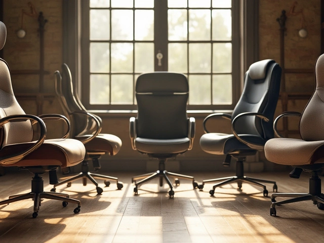
Choosing the Best Office Chair for Prolonged Computer Use
9 Dec
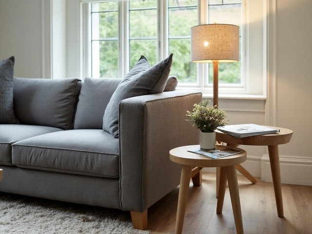
Choosing the Ideal Height for Your End Tables: A Guide for Perfect Balance with Your Couch

8 Oct
Best Ergonomic Chair for Long Working Hours - Expert Guide 2025
22 Dec
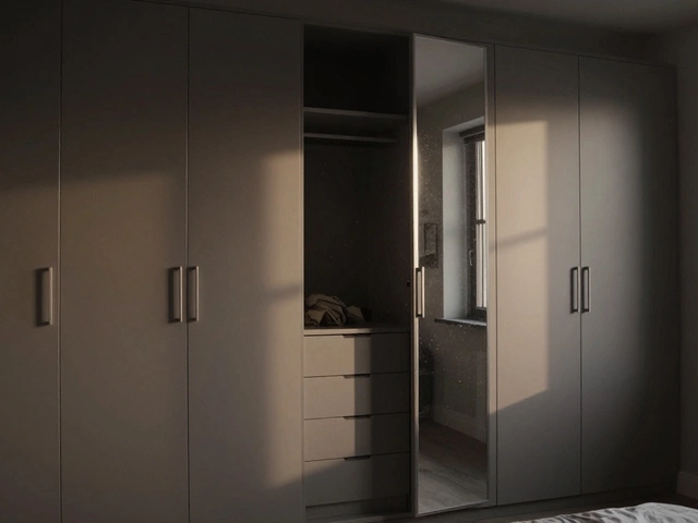
What Are the Disadvantages of Fitted Wardrobes? Hidden Costs and Practical Pitfalls
25 Oct
Wall‑Mounted TV vs TV Stand: Which Is the Better Choice for Your Living Room?