2024's Most Stylish Furniture Colors: Trends, Tips & Ideas
Unpack the top trending furniture colors in 2024 with expert-backed tips. Discover modern palettes making waves in New Zealand homes and how to style them for a fresh look.
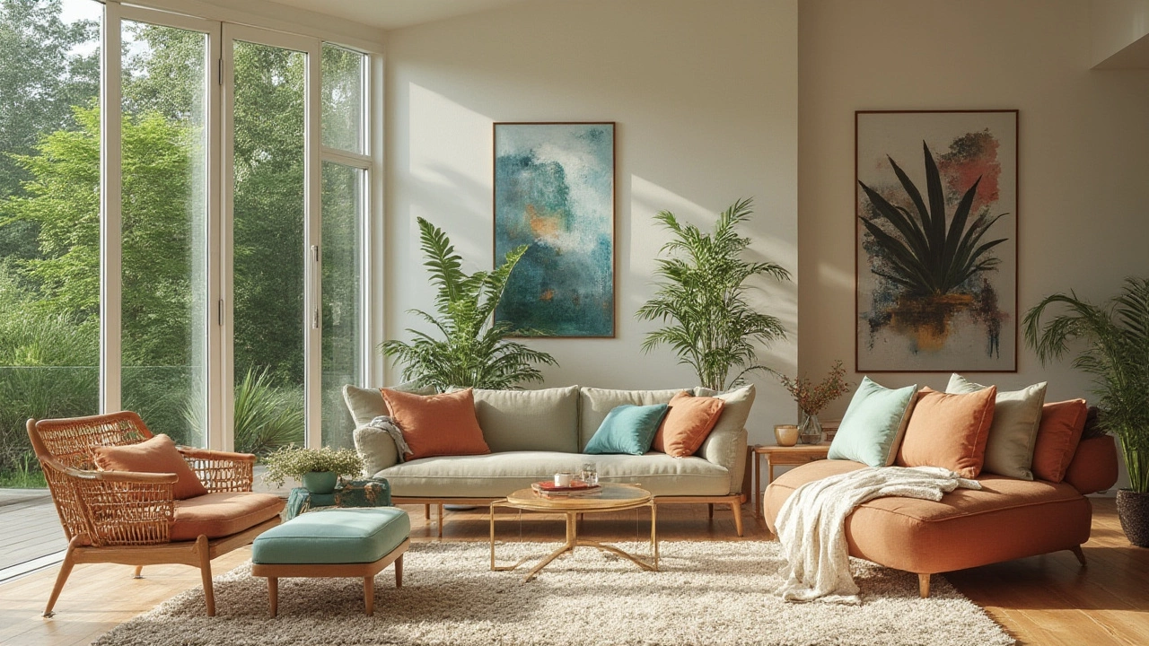
Thinking about a new colour for your room? In New Zealand the weather, light and lifestyle shape the palette we love. From coastal blues to warm earth tones, the right shade can make a small classroom feel open or a living room feel cozy. Below you’ll find the most popular colours right now and simple steps to use them with your furniture.
NZ gets a lot of natural light, especially on the North Island. That bright, clean light makes lighter shades pop and softens darker hues. If your space has big windows, try a light grey or warm white – the light will bounce around and keep the room feeling airy. In rooms with fewer windows, deeper colours like muted teal or soft terracotta add warmth without feeling cramped.
Coastal Blue: Inspired by the Pacific, this shade works great in bedrooms and study areas. Pair it with white desks, wooden chairs and a splash of natural fibre rug to keep the vibe relaxed.
Earthy Sage: A muted green that feels calm and natural. It matches nicely with metal‑legged chairs, light oak desks and plants. Use it on a feature wall or as the main colour for a classroom that needs a soothing backdrop.
Warm Terracotta: Perfect for living rooms or staff lounges. It brings a hint of the South Island’s volcanic soil indoors. Combine it with neutral sofas, dark brown storage units and a few gold accents for a balanced look.
Soft Charcoal: A modern alternative to black. It hides wear and tear on high‑traffic furniture and makes colourful accessories stand out. Try it on a lower wall behind a desk so the surface stays bright and the contrast feels intentional.
Bright White: Still a safe choice for schools and offices because it reflects light and makes any furniture colour pop. Use it as a base and add colour through cushions, artwork or a bold rug.
When you choose a colour, think about the furniture you already have. A dark wooden desk looks striking against a light wall, while a light‑coloured chair feels fresh in a deeper hue. Test paint samples on the wall and watch them at different times of day – the colour can shift with the sun.
Don’t forget texture. Matte finishes absorb light and feel calm, whereas satin or semi‑gloss finishes reflect a bit of light and can brighten a room. For high‑traffic areas, a washable satin paint is practical and still looks polished.
Finally, keep the overall vibe of your space in mind. If you want a modern, minimal look, stick to a limited colour palette – two main shades and one accent. If you love a cosy, lived‑in feel, layer several complementary tones and let your furniture add visual interest.
Ready to pick a new shade? Start with a small wall, test a sample, and watch how it works with the light and your existing furniture. The right colour can transform a plain room into a place that feels welcoming, focused and uniquely yours.
Unpack the top trending furniture colors in 2024 with expert-backed tips. Discover modern palettes making waves in New Zealand homes and how to style them for a fresh look.
18 Jan
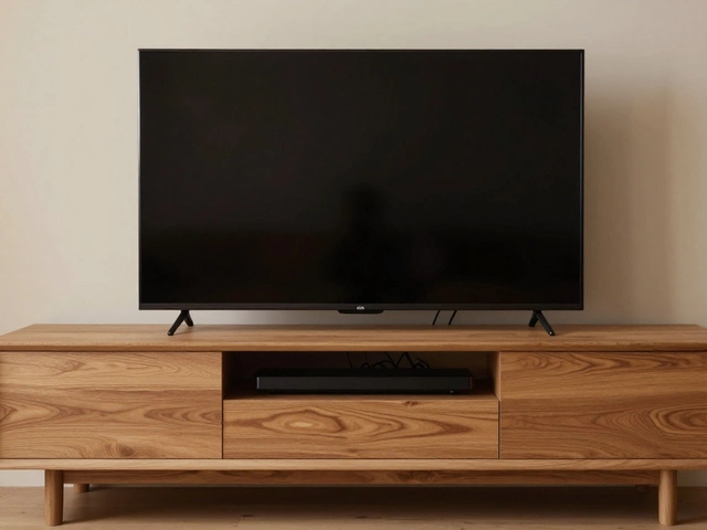
How Long Should a TV Stand Be for a 65-Inch TV?

13 Oct
Can Vinegar Stop Mold Growth? Effective Natural Remedy Guide
6 May
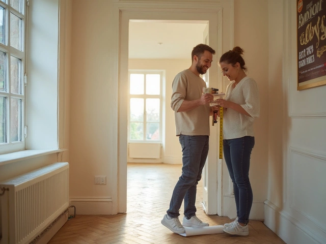
How to Tell if a Couch Will Fit Around a Corner

13 May
Is It OK to Sit on a Chair All Day? Your Office Chair Habits Examined
20 Jan
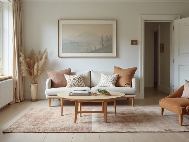
Ideal Coffee Table Distance from Your Couch: A Guide for Perfect Living Room Layout