Bedroom Furniture Timelessness Score
Step 1: Your Room Conditions
Step 2: Your Furniture Choice
Your Timelessness Results
Your Score Title
Long-Term Benefits
Next 5 Years
Next 10+ Years
Why Color Matters More Than You Think
You might think style is all about shape and legs-whether your nightstand has hairpin legs or tapered feet. While that plays a part, color is actually the most stubborn variable when it comes to longevity. I've walked into enough homes here in Auckland to know the drill: the trendiest piece five years ago usually ends up clashing with everything today. If you are hunting for bedroom furniture colors that survive design shifts, you need to ignore what magazines call "it" right now.
The goal isn't just picking something nice. It's choosing something that remains compatible with the next three renovations. A bed frame purchased in 2026 should still feel appropriate in 2036 without needing a fresh coat of paint or covering the entire thing with linens to hide its true nature.
This guide breaks down the specific hues and tones that have held their ground through decades of interior shifts. We aren't talking about wall paint here; this is about hard surfaces, upholstery, and frames.
The Endurance of True Neutrals
The White Spectrum
When people hear "white furniture," they often imagine hospital sterile environments. That pure, icy white does date quickly. Instead, look for off-whites. Soft, creamy neutrals act as a perfect canvas for changing decor accents. These colors reflect light effectively, which helps smaller bedrooms feel larger-a common issue in older city apartments.
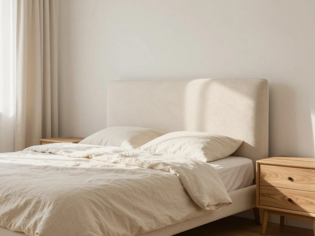
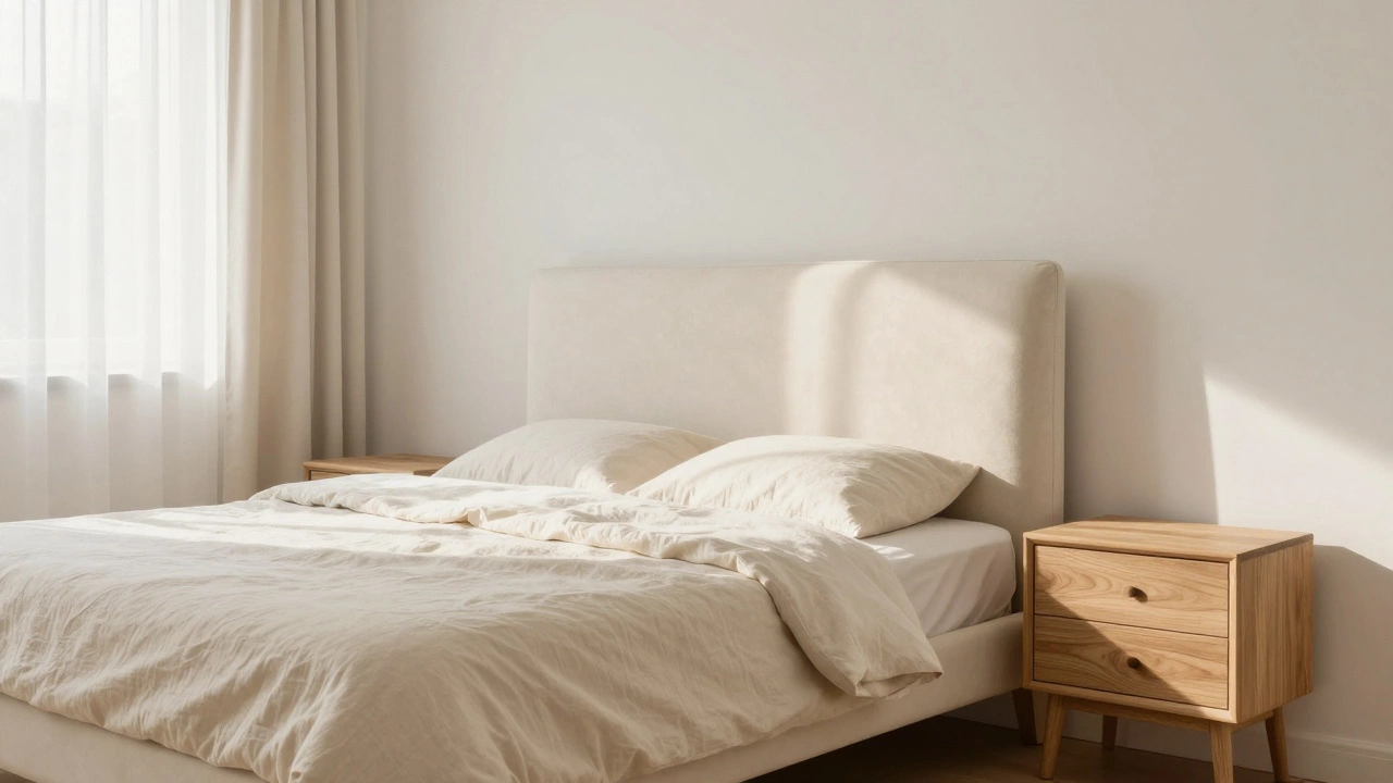
Eggshell or Ivory provides warmth that stark white misses. This distinction is crucial in our climate. In regions with cooler mornings, a pure white can feel cold and unwelcoming upon waking. An ivory painted headboard absorbs a bit of warmth and fits seamlessly with both traditional bedding and modern minimalist sheets.
The Rise of Greige
Grey was everywhere for a long time. By 2026, we know grey leans cool. "Greige"-the hybrid of grey and beige-is where the real longevity lies. It sits on the fence between warm and cool undertones. When you select a greige finish for wardrobes or dressers, you allow yourself flexibility with accent pillows, rugs, and wall art later on.
Natural Wood Tones That Age Well
Artificial stains often look obvious the moment they chip or fade over time. Natural wood grains tell a story that doesn't rely on fashion weeks. If you want pieces that never go out of style, natural timber offers the highest probability of success.
| Wood Type | Visual Characteristics | Best For |
|---|---|---|
| Natural Oak | Light golden tones, visible grain | Modern, Scandinavian styles |
| Walnut | Rich brown, deep grain, sleek | Mid-century modern, classic luxury |
| Teak | Straight grain, oil-rich, warm | Damp climates, durable outdoor/indoor transitions |
Oak and Ash
These lighter woods have seen a massive resurgence. The reason is simple: they make a room feel airy. In a bedroom, where rest is the priority, heavy dark woods can sometimes feel oppressive. Oak brings texture without overwhelming the space. If you pair oak with metal hardware or glass shelves, you bridge the gap between rustic and contemporary effortlessly.
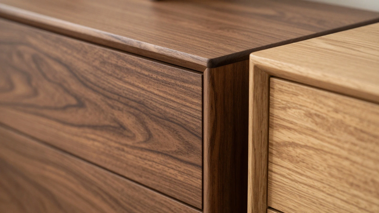
Walnut for Depth
While oak rules the light side, walnut dominates the sophisticated side. It is darker than oak but lacks the artificial blackness of charcoal veneers. Real walnut varies slightly from board to board, adding character. A walnut dresser looks just as good in a retro setting as it does in a high-tech smart home.
The Role of Surface Finishes
Color is one thing, but how that color sits on the surface changes everything. A high gloss white looks very different from a matte eggshell.
Matte Versus Gloss
Glossy finishes were the standard for decades, offering a sense of cleanliness. However, gloss picks up every fingerprint and scratch. In 2025 and beyond, consumers are shifting back toward matte or satin finishes. Matte absorbs light rather than reflecting it, giving the furniture a softer appearance. This is vital for a bedroom environment. Soft light equates to soft visual tension.
If you do choose gloss, keep it to small details or high-traffic surfaces. For large surfaces like wardrobe doors or bed frames, a low-sheen finish hides imperfections much better. Over ten years, a scratched gloss door looks damaged; a scratched matte door just looks weathered.
Upholstered Headboards and Textiles
Wood and paint aren't your only options. Fabrics introduce texture and depth that solid materials cannot achieve alone.
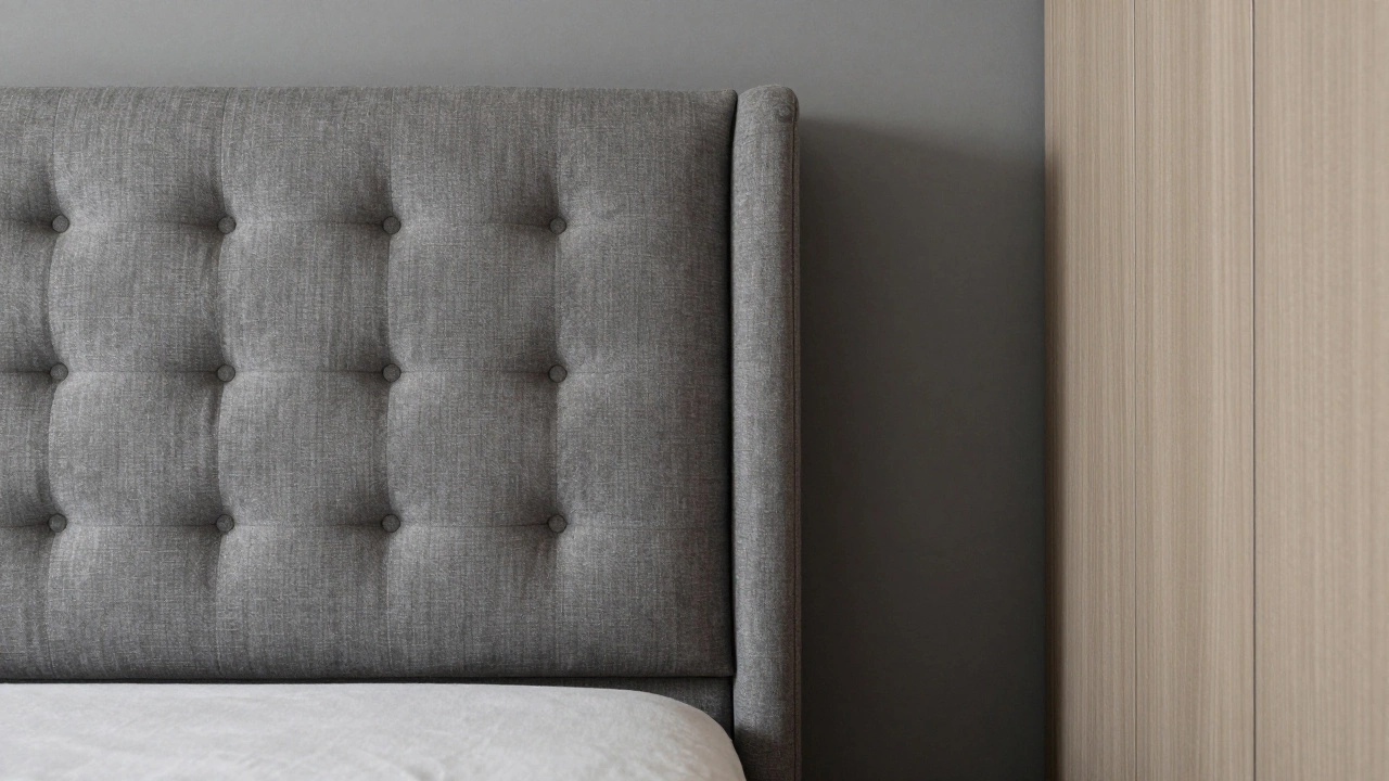
Neutral Uplholstery
Fabric headboards can define the vibe of the room instantly. Stick to linen, velvet, or cotton blends. These materials age with dignity. They wear well over time, unlike synthetic fabrics that may pill or look cheap after daily contact.
Avoid loud prints or highly saturated colors on fabric. A textured linen in oatmeal or stone gray works. These fabrics offer pattern without relying on color contrast. The tactile quality adds luxury without committing you to a strict color scheme.
Solid Colors for Longevity
Just like with solid wood, sticking to solid color fabrics prevents the room from looking "busy." If you crave pattern, use throw pillows instead of upholstering the entire headboard. Pillows are cheap to replace; re-upholstering a headboard is costly.
Lighting Conditions and Your Choice
We live in a place with variable light. In Auckland, our days get shorter and darker quite early in winter. In other locations, sunlight floods in all day. Your furniture color interacts directly with this ambient light.
North-Facing Rooms: Often receive less direct sun. Here, lighter woods like Oak or Birch prevent the room from feeling cave-like. Avoid dark espresso cabinets in these spots unless you plan to install significant artificial lighting.
South/West-Facing Rooms: These get strong afternoon sun. You can handle darker woods here, as the light keeps them vibrant. However, too much direct sun can bleach lighter painted finishes over years, so ensure any painted furniture uses UV-resistant lacquer.
Combining Multiple Tones
One strategy that prevents boredom is mixing tonal families. You don't have to match your bed and bedside tables exactly. Mixing natural wood tones (like oak and walnut) within the same room creates a curated, collected look.
For example, an oak bed frame paired with a walnut dresser introduces visual interest while keeping the overall "wood" theme cohesive. Just ensure the undertones align-don't pair orange-toned cherry wood with blue-toned pine. Both must lean either warm or cool, not split the spectrum.
What to Avoid for Long-Term Success
Some colors scream "trends." Knowing what to skip is half the battle.
- Bright Primary Colors: Red, blue, or yellow painted furniture is fun, but rarely lasts a decade. Keep these to accessories like chairs or lamps.
- High-Gloss Black: Shows dust constantly and tends to crack under stress.
- Distressed/Weathered Looks: What looked "shabby chic" in the 2000s now looks unfinished. A smooth factory finish always ages cleaner than pre-worn distressed wood.
Resale value also ties into this. A buyer looking for a used bed online prefers a generic neutral over a bold statement piece. Keeping things timeless helps future sales if you ever need to sell your belongings quickly.
Practical Maintenance Tips
Keeping furniture looking new extends its life regardless of color. Dust weekly with a microfiber cloth to prevent buildup in crevices. Avoid placing drinks directly on surfaces to prevent water rings on matte finishes. For wooden pieces, apply a natural wax annually to replenish oils and protect the grain.
Frequently Asked Questions
Is white bedroom furniture practical?
Yes, provided you choose off-white or cream shades rather than stark clinical white. These softer tones hide dust slightly better and feel warmer in a sleeping environment. Regular dusting is essential for maintaining the brightness.
Can I mix different wood colors in one room?
Absolutely. Mixing wood tones like light oak and dark walnut creates depth and dimension. Just ensure the undertones are harmonious. Avoid clashing orange tones with blue-grey tones.
Do light-colored beds show dirt easily?
Fabric headboards can trap dust, but spills are less visible on medium-toned fabrics. Solid wood or matte finishes generally show dirt less than high-gloss black, which highlights scratches and fingerprints immediately.
What is the best furniture color for resale value?
Neutral woods and unpainted surfaces hold value best. They appeal to the widest range of buyers and allow them to envision their own decor without needing immediate modification.
How does lighting affect furniture choice?
Dark woods work well in sunny rooms where light bounces around. In north-facing rooms lacking direct sun, lighter woods and paints help open up the space and prevent the room from feeling cramped or gloomy.
Making the Final Call
Choosing the right color involves balancing personal preference with the reality of time passing. Trends will shift, seasons will change, and your needs will evolve. By anchoring your bedroom with neutral woods, matte finishes, and versatile earth tones, you build a foundation that supports your life for years to come rather than forcing you to update again before you're ready.