You might not think the colour of your bookshelf matters much, but it makes a huge difference. The right shade can highlight your books, make your room feel bigger or cosier, or even hide a mess. The wrong one? Suddenly, your shelves stick out like a sore thumb or disappear completely against your wall.
If you’ve ever spent an afternoon rearranging your living room only to feel like something’s still off, your bookshelf colour could be the culprit. It’s not just about matching your wall paint or your sofa—certain colours actually influence your mood, how organized your space looks, and even how you experience your favourite reads. Ever notice how white shelves feel fresh and airy, while black ones add instant drama?
Getting the colour right means thinking about your space, the amount of light, and the vibe you want. You don’t have to go trendy if that’s not you; a classic wood tone, a bold pop of colour, or even soft pastels all do different things for a room. Let’s get into what those things are, so you can skip the guesswork and finally get your shelves working for you.
- How Colour Changes the Look of Your Bookshelf
- Popular Bookshelf Colours and What They Do
- Matching Shelf Colour with Room Style and Lighting
- Tips and Mistakes to Avoid When Choosing Bookshelf Colour
How Colour Changes the Look of Your Bookshelf
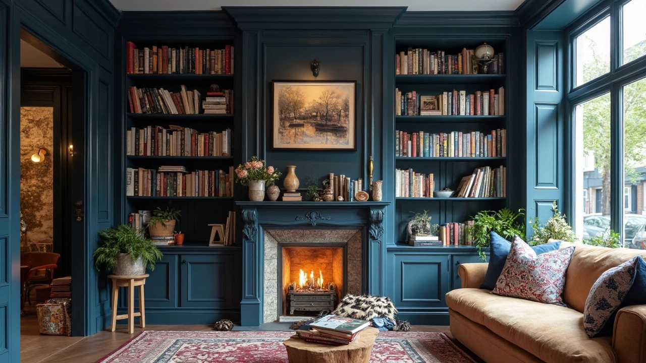
Colour does way more than just sit pretty on your bookshelf. It affects the whole mood of your room and the way you notice, or even use, your shelves. If you go with a best bookshelf colour like white or light grey, shelves feel more open and your books tend to pop—great for small rooms or if your book collection is full of cool covers. On the other hand, darker shades like black or navy add serious depth, turning shelves into statement pieces that draw the eye, but they can also make a cramped room feel tighter if you’re not careful.
What’s wild is that your shelf colour can actually change how organized your stuff looks. With white or pale colours, every little bit of clutter stands out, which can be a good thing if you like accountability—or a nightmare if you prefer a lived-in vibe. The darker the shelves, the more they disguise dust and mismatched spines, but sometimes they eat up all the light, especially in rooms that already feel kinda dark.
If you’ve got a ton of books in bold shades, a neutral shelf colour will show them off better than a bright-saturated shelf that might clash. Natural wood or soft pastels are underrated for bookcase styles that blend into the background but make your stuff feel homey and intentional. And get this: IKEA once shared that their white Billy bookcases outsell all their coloured ones by a massive margin—people just love the clean, flexible look.
Here’s a quick rundown of common shelf colours and what they do for your space:
- White/light grey: Airy, modern, boosts brightness—best for minimalists or small rooms.
- Black/navy: Dramatic, high-contrast, makes books and decor pop but can shrink a space.
- Wood tones: Warm, classic, hides dust better, works in most rooms.
- Bolder colours (green, blue, red): Adds personality, great for playful or themed rooms, but needs careful matching with books and decor.
Different finishes matter too. High-gloss shines and bounces light, which is nice for showing off, while matte is low-key and hides fingerprints and smudges. There’s no universal winner, but knowing what vibe you want (or what annoys you least) makes picking the right shelf colour way less stressful.
Popular Bookshelf Colours and What They Do
If you’re hunting for the best bookshelf colour, it helps to know what each option actually does for your space. Some colours keep things simple and clean, while others go bold or work to make organizing easier. Here’s a clear rundown of how the most popular bookshelf colours play out in real homes:
- White: This is hands down the most popular shade for bookshelves. White shelves look fresh, make even small rooms feel open, and let your books and decor shine without distraction. You see white bookcases everywhere—from IKEA’s Billy to custom built-ins—because they go with any room style. If you like the clean look, white is unbeatable, but it can show dust and scuffs more than darker colours.
- Black: Black adds instant drama and feels a bit more upscale than white. It can make colourful book covers pop and actually hides dust better than you’d expect. Use black for a modern vibe, but just know it can make tight rooms feel smaller, especially if there’s not a lot of light.
- Wood Tones (Brown, Oak, Walnut): Classic never goes out of style. Wood-toned shelves—from light birch to deep walnut—bring warmth and a cozy, lived-in feel. People love wood tones because they hide fingerprints and blend in pretty much anywhere. Want to go for a traditional bookcase style? Wood is your friend.
- Grey: Grey is pretty much the middle ground. It hides marks, doesn’t feel as harsh as black, and it’s a go-to if you want something modern but a bit warmer. Grey shelves look especially good in spaces with lots of cool colours or minimalist vibes.
- Bold Colours (Navy Blue, Green, Yellow, Red): Want your shelves to stand out or add fun to a room? Go bold. Navy blue and green are popular right now; they feel rich, work with gold hardware, and don’t show dust easily. Yellow and red are trickier—they’re full of personality, great for kids’ rooms or as a pop in otherwise neutral spaces, but can overwhelm if you go too bright.
- Pastels: Soft pinks, pale blues, and minty greens aren’t just for kids. They’re an easy way to add colour without the shelf taking over the room. Pastels are perfect if you want a bit of mood but don’t love bold statements.
Here’s a quick glance at what people are choosing:
| Bookshelf Colour | Popularity (2024) | Best Fit For |
|---|---|---|
| White | 45% | Minimal, bright, small rooms |
| Black | 15% | Modern, moody, high-contrast spaces |
| Wood Tones | 30% | Classic, traditional, cozy rooms |
| Bold/Accent Colours | 7% | Statement walls, creative zones |
| Grey & Pastels | 3% | Contemporary, soft style |
No bookshelf colour is “wrong”—it’s really about what matches your vibe and how your shelf fits into the rest of the room. Real tip: Always check your lighting before picking a shelf colour. Natural light makes dark shelves look less intense, while artificial light can make white ones feel clinical. Whatever you choose, it’s your home decor, so pick a shelf you’ll want to look at every day.

Matching Shelf Colour with Room Style and Lighting
Nailing the best bookshelf colour isn’t just about your favourite shade. It’s about how that colour plays with the look of your room and the type of light you’ve got. Light makes a huge difference—natural sunlight, yellow lamps, or harsh LEDs all change how a bookshelf colour looks by the hour.
Start with your room’s style. If your place is modern, clean, and full of neutrals, you can’t go wrong with white, light grey, or even black shelves for a sharp look. Vintage or cottage styles love pastel tones or classic wood finishes. Got boho vibes? Try bold, saturated colours—deep blue or forest green really work without being too in-your-face.
Now, lighting. North-facing rooms tend to feel cooler and darker, so a white or light-toned bookshelf helps bounce what little light you have around. South-facing rooms with loads of sun let you play with darker colours—think navy, espresso, or even matte black. In small or windowless spots, don’t get too moody; stick with light shades so things don’t close in on you.
- If your walls are dark, contrast is your friend. White or pale shelves show off your books and stop the room from feeling heavy.
- For rooms with all light walls, coloured or wood-tone shelves add much-needed depth and keep things from feeling washed out.
- Open-plan spaces? Try matching your bookcase style and colour to another big piece of furniture for a more put-together feel—like echoing your table or sideboard.
If you’re still on the fence, here’s a quick buffet of what’s popular and what works in most spaces:
| Room Type | Good Shelf Colours | Why It Works |
|---|---|---|
| Small or dark rooms | White, pale grey, light oak | Maximizes brightness and space |
| Rustic/cosy style | Walnut, natural pine, olive green | Feels warm and grounded |
| Modern spaces | Matte black, navy, white | Crisp and stylish |
One last tip: always test a paint swatch or finish in your room first. Light and surroundings will totally change how that bookshelf paint idea looks at home compared to the hardware store or your phone screen.
Tips and Mistakes to Avoid When Choosing Bookshelf Colour
Picking a bookshelf colour seems simple, but it gets tricky fast. Here’s the lowdown on what works and what makes people regret their choice. These tips can help you make your best bookshelf colour decision way easier.
- Test paint swatches first. That one bright colour you loved in the paint aisle? It might look totally different in your living room’s lighting. Grab a couple of sample pots and paint small areas on the shelf itself or on cardboard you can tape up. Check these samples during daytime and at night, since colours shift with different lights.
- Consider how much attention you want on the bookshelf. Want your bookshelf paint ideas to stand out? Go bold. Want your books and decor to do the talking? Choose something more subtle or close to the wall colour. Neutral tones like white, beige, or grey keep things simple and let your stuff shine.
- Think about cleaning and upkeep. White shelves look clean, but they show dust and fingerprints fast. Black hides marks but can show dust or wear more than you’d think. Medium shades and wood tones win here—they don’t make every smudge pop.
- Match it up (or don’t) with your other furniture. Matching your bookshelf to the trim, flooring, or big pieces of furniture can make a room feel pulled together. Go for a different shade if you’re after contrast or a feature piece. It works both ways as long as it’s what you want.
- Don’t forget about your books. If you’ve got a ton of colourful spines, a neutral shelf helps them pop. If most of your books look similar, a unique colour can add interest to the whole thing.
Common slip-ups? Here are a few:
- Picking last-minute—Choosing the colour as an afterthought means it probably won’t tie the room together.
- Ignoring natural light—Dark shelves in a dim room look heavy and claustrophobic. Light shelves in a bright spot can make things feel too washed out.
- Going trendy without thinking it through—That deep blue or blush pink seems cool now, but will you love it next year? Make sure you’re picking for you, not just the internet.
- Forgetting about finish—Glossy paint looks modern but shows dust and fingerprints more than a matte or satin finish. Choose what fits your lifestyle.
| Colour | Shows Dust | Fades Over Time | Easy to Clean |
|---|---|---|---|
| White | High | Low | Medium |
| Black | Medium | Medium | High |
| Natural Wood | Low | Low | High |
| Bold Colours | Medium | High (may fade in sunlight) | Medium |
Here’s one final reality check: there’s no single right answer for the best bookshelf colour. It’s all about what works for your space, your stuff, and what you actually like seeing every day.