Bookcase Color Strategy Advisor
Select your room characteristics below to receive a tailored recommendation for your built-in bookcases.
Recommendation
Note: This preview simulates the visual weight of the strategy. Actual paint samples should be tested in your specific lighting conditions.
You’re standing in your living room, staring at that empty alcove you’ve been dreaming about for years. The builder has quoted you for custom joinery-specifically, a set of floor-to-ceiling shelving units integrated directly into the wall structure. But now you hit the classic designer’s dilemma: should you paint them the same shade as the walls to make them disappear, or go bold and let them stand out?
There is no single "right" answer here because it depends entirely on what you want the room to feel like. Do you want space? Go monochromatic. Do you want drama? Create contrast. But before you buy a tin of paint, you need to understand how light, texture, and perception work together. This isn’t just about aesthetics; it’s about manipulating the architecture of your home.
The Case for Matching: Creating Seamless Space
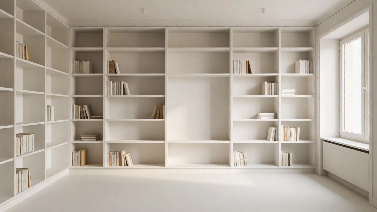
If you live in an older Auckland villa with low ceilings or a compact apartment where every square meter counts, matching your built-in bookcases to the wall color is often the smartest move. Why? Because it reduces visual clutter. When the shelves blend into the background, the eye doesn’t register them as separate objects blocking the view. Instead, the wall feels continuous, making the room appear larger and more open.
This technique works best when you use the exact same paint formula, not just a similar shade. Even a slight difference in undertone can create a visible seam under certain lighting conditions. If you’re going this route, consider using a matte or eggshell finish for both the wall and the shelves. High-gloss finishes reflect light differently, which can highlight the edges of the joinery and break the illusion of continuity.
However, there’s a catch. If everything is white-on-white, the room can feel sterile or clinical. To avoid this, you need to introduce texture. Maybe your books provide the color pop, or perhaps you add wooden trim inside the recesses. The goal is to make the shelves recede so that the contents become the focal point, not the furniture itself.
The Case for Contrast: Making a Statement
On the flip side, if you have high ceilings or a large, open-plan living area, hiding the bookcases might be a missed opportunity. A contrasting color turns the shelving unit into an architectural feature. Think of it as framing a piece of art, except the art is your library.
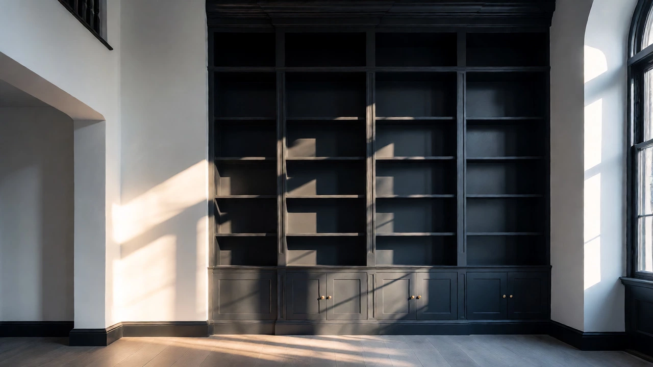
Dark colors are particularly effective here. Painting deep navy, charcoal, or forest green creates depth and sophistication. It draws the eye inward, creating a cozy, intimate atmosphere perfect for reading nooks. This approach also helps define zones in open-plan spaces. For example, a dark blue bookcase against a light gray wall can visually separate a home office corner from the main lounge area without needing physical partitions.
But beware of shrinking the room. Dark colors absorb light. If your built-ins are small or the room lacks natural sunlight, painting them black might make the space feel cramped. In these cases, opt for mid-tone contrasts rather than stark blacks. A sage green or terracotta offers personality without overwhelming the senses.
Material Matters More Than Paint
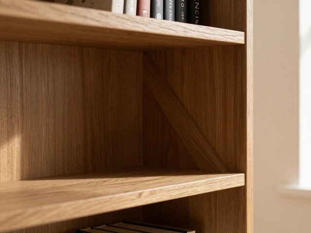
Here is something many homeowners overlook: the material of your built-ins changes the rules. Not all bookcases are painted MDF. If you’re installing solid timber joinery, such as oak, pine, or macrocarpa, you rarely want to match the wall color completely unless you’re aiming for a very specific rustic or farmhouse look.
| Material Type | Recommended Color Strategy | Visual Effect |
|---|---|---|
| Painted MDF/Plywood | Match Wall (Monochromatic) | Seamless, modern, expands space |
| Solid Timber (Stained) | Contrast or Complement | Warmth, texture, traditional charm |
| Metal Frames | Neutral or Black | Industrial, sleek, contemporary |
| Lacquered Wood | High-Gloss Contrast | Luxurious, reflective, bold |
Natural wood brings its own warmth and grain pattern. Trying to paint over beautiful timber just to match a beige wall wastes the material’s potential. Instead, choose a wall color that complements the wood tone. Warm woods like oak pair well with creamy whites or soft taupes. Cooler woods like ash or walnut look sharp against crisp whites or cool grays.
Lighting Changes Everything
You cannot decide on color without considering light. Paint looks different at 10 AM than it does at 8 PM. Before committing to a full coat, test your samples. Paint large patches on both the wall and a scrap piece of the shelf material. Observe them throughout the day.
Northern-facing rooms in New Zealand get consistent, bright daylight. Here, you can afford to play with darker contrasts because the ambient light prevents shadows from becoming too heavy. South-facing rooms receive cooler, softer light. These spaces benefit from warmer tones to counteract the chill. If you match the wall color in a south-facing room, ensure the paint has warm undertones (yellow or red) to prevent the space from feeling gloomy.
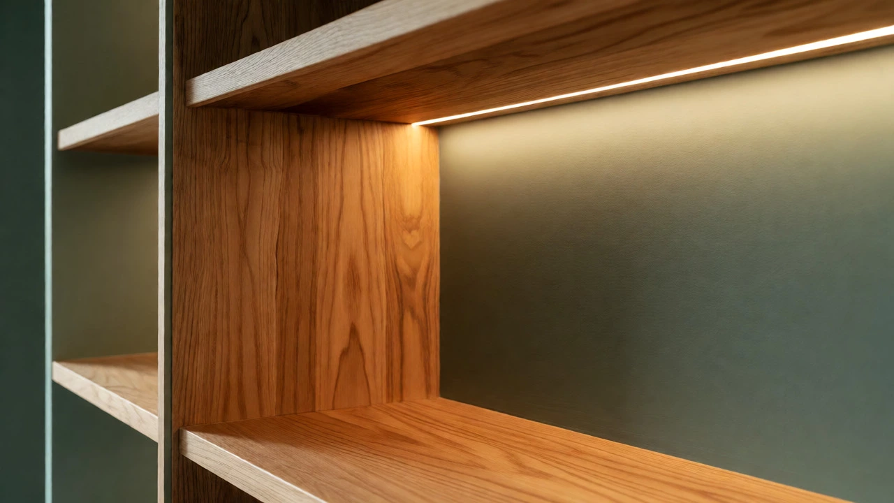
Also, think about artificial lighting. Integrated LED strip lights inside the shelves change the game entirely. If you plan to light the shelves internally, matching the back panel to the wall color creates a glowing effect. Contrasting colors make the light source more obvious, which can be great for showcasing specific collections but distracting if you just want ambient glow.
The "Hidden Shelf" Illusion
Want the best of both worlds? Try the hidden shelf trick. Paint the vertical sides and horizontal shelves the same color as the wall, but paint the back panel a slightly different shade-or even a wallpaper pattern. This adds depth without breaking the silhouette of the unit.
Another popular trend is the "floating" effect. By painting the supports the same color as the wall and using thin brackets, the shelves appear to hover. This works exceptionally well with white-on-white schemes. It keeps the room airy while providing functional storage. Just ensure the structural integrity is sound; floating shelves need robust anchoring into studs.
Practical Tips for Execution
Ready to pick up the brush? Follow these steps to avoid regret:
- Prime correctly: Never skip priming, especially if you’re painting over old varnish or raw wood. A good primer ensures uniform color absorption.
- Use the right sheen: For high-traffic areas like living rooms, use satin or semi-gloss for the shelves. They wipe clean easier than flat paint. Keep the walls matte to hide imperfections.
- Consider the books: Your books are part of the color scheme. If you have colorful spines, a neutral shelf background lets them shine. If your books are mostly uniform (e.g., leather-bound classics), a colored shelf adds interest.
- Check the hardware: Visible hinges or brackets should either match the shelf color or be deliberately distinct. Mixed metals can look messy unless intentional.
Remember, trends fade. White-on-white interiors dominated the early 2010s, while maximalist color drenching is having a moment in 2026. Choose a palette that reflects your personal taste, not just what’s popular on social media. You’ll live with these shelves for decades, not just for the next Instagram post.
Frequently Asked Questions
Should I paint the back of the bookcase the same color as the front?
Not necessarily. Painting the back panel a lighter or darker shade than the shelves can create an illusion of depth. A common technique is to paint the back a slightly deeper tone than the sides, making the shelves appear to project forward. However, if you want a seamless look, matching all surfaces is acceptable, provided the lighting doesn't cast harsh shadows that reveal the seams.
What is the most timeless color for built-in bookcases?
White and off-white remain the most versatile and timeless choices because they complement any decor style and maximize light reflection. However, deep greens and navies have gained status as modern classics, particularly in traditional homes. Avoid trendy neon or highly saturated hues if you want longevity, as these tend to date quickly.
How do I make small bookcases look bigger?
To make small built-ins feel larger, extend them floor-to-ceiling if possible. Use a light color that matches the wall to blur the boundaries. Additionally, adding glass doors or leaving some sections open with minimal styling reduces visual weight. Mirrored backing panels are another trick to double the perceived depth.
Can I mix wood and painted finishes in one unit?
Yes, this is a sophisticated design choice. For example, you might paint the carcass (the outer frame) in a solid color to match the wall, but leave the adjustable shelves in natural wood. This highlights the functionality of the shelves while keeping the overall footprint subtle. Ensure the wood tone complements other furniture in the room.
Does ceiling height affect the color decision?
Absolutely. In rooms with low ceilings (under 2.4 meters), matching the bookcase color to the wall helps draw the eye upward and prevents the unit from feeling bulky. In rooms with high ceilings, you have more freedom to use contrasting colors because the vertical space allows the unit to act as a standalone sculpture without overwhelming the room.