ADHD-Friendly Chair Color Selector
Why this works for you:
Have you ever sat down to work, only to feel your brain start racing before you’ve even opened a single document? For people with ADHD is a neurodevelopmental condition characterized by inattention, hyperactivity, and impulsivity, the visual environment plays a surprisingly huge role in mental clarity. We often think of noise-canceling headphones or fidget toys as our primary tools for focus, but we rarely consider the chair we sit on all day. The truth is, the office chair is a piece of ergonomic furniture designed for prolonged sitting at a desk isn’t just about lumbar support; its color sends direct signals to your brain.
If your workspace feels like a chaotic storm of bright reds, stark whites, or neon accents, you might be fighting a losing battle against sensory overload. Choosing the right hue can lower anxiety, reduce distractions, and help you stay seated long enough to get things done. Let’s break down which colors actually work for the ADHD brain and how to pick an office chair that supports your focus rather than draining it.
The Science Behind Color and Focus
To understand why color matters, we have to look at how the brain processes visual information. People with ADHD often experience sensory processing sensitivity is a heightened reaction to environmental stimuli such as light, sound, and texture. This means that while others might ignore a brightly colored wall or a patterned carpet, your brain might register it as background noise that demands attention.
Colors are not just aesthetic choices; they are physiological triggers. Warm colors like red and orange increase heart rate and alertness, which sounds good for energy but can quickly tip into agitation or anxiety. Cool colors, on the other hand, tend to slow down physiological arousal. When you’re trying to enter a state of flow-where time seems to vanish and productivity spikes-you need an environment that doesn’t compete for your cognitive resources. A calming color palette acts as a visual anchor, allowing your prefrontal cortex to regulate attention more effectively without being hijacked by stimulating visuals.
Top Calming Colors for ADHD Workspaces
Not all neutral tones are created equal. Some shades soothe, while others can feel sterile or depressing. Here are the most effective colors for creating a calm, focused environment for someone with ADHD.
Soft Blues
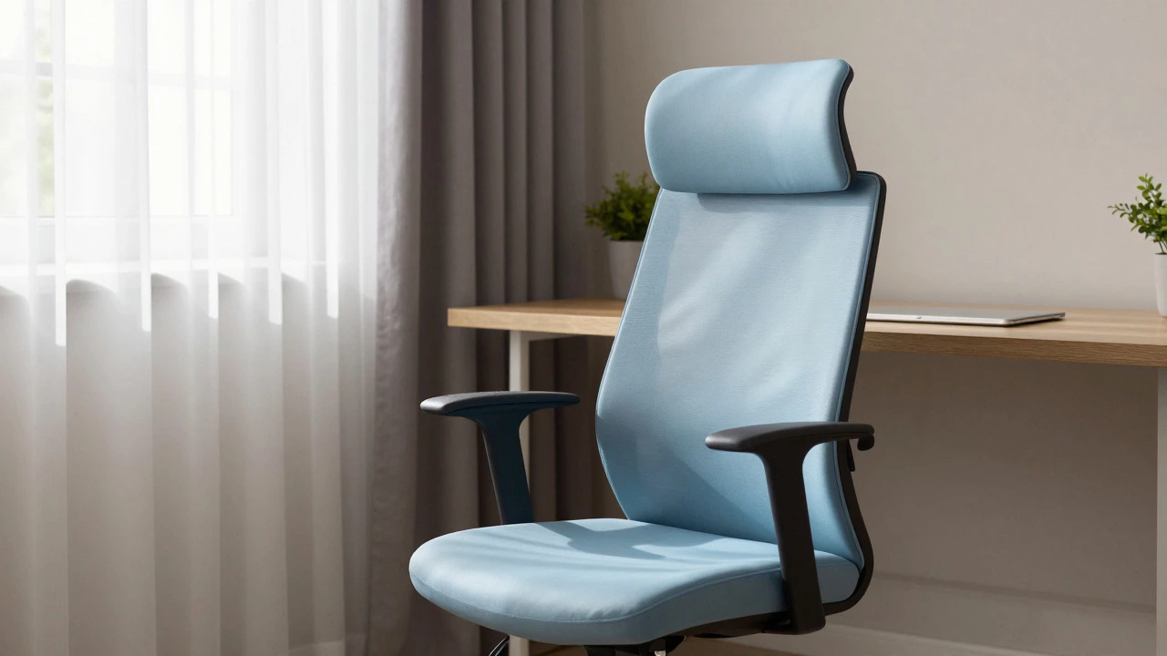
Blue is widely recognized as the most calming color for the human brain, and this holds true for ADHD brains too. Soft blues, such as sky blue, powder blue, or slate gray-blue, mimic the natural elements of water and sky. These hues have been shown to lower blood pressure and reduce feelings of restlessness. An ergonomic office chair is a chair designed to support the natural curve of the spine and promote healthy posture in a soft blue tone can create a sense of stability and tranquility. It’s less likely to trigger the "fight or flight" response that brighter colors might incite.
Sage Greens
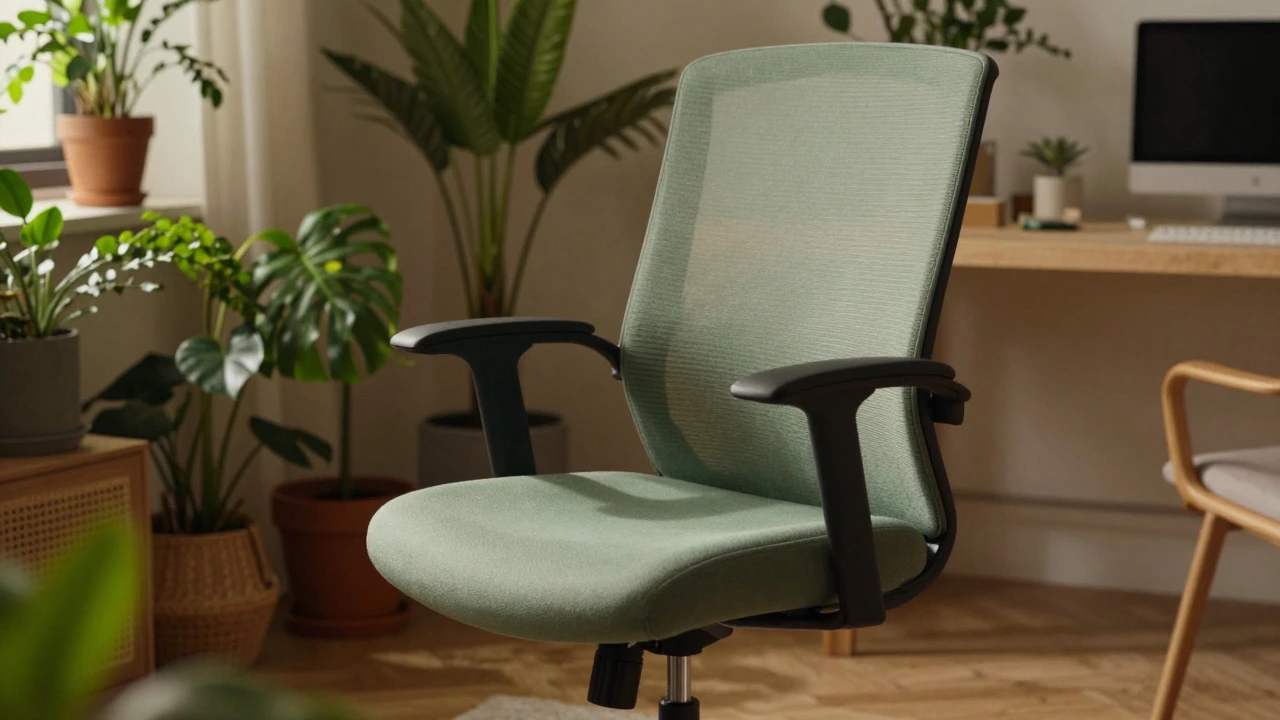
Green is the color of nature, and biophilic design-the concept of connecting indoor spaces with the natural world-is particularly beneficial for ADHD. Sage green, olive, or muted forest greens provide a grounding effect. Unlike blue, which can sometimes feel cold, green feels balanced and harmonious. It reduces eye strain and promotes a sense of renewal. If you spend hours staring at screens, having a chair in a sage green tone can offer a subtle visual break that feels restorative rather than distracting.
Warm Neutrals: Beige and Taupe
While stark white can be glaring and overly stimulating, warm neutrals like beige, taupe, or cream offer a gentle backdrop. These colors don’t demand attention. They recede visually, allowing you to focus on your tasks rather than your surroundings. A taupe office chair blends seamlessly into most home offices, reducing visual clutter. The key here is warmth; avoid cool grays that can feel institutional or depressing, and opt for earthy tones that feel cozy and safe.
Colors to Avoid (Or Use Sparingly)
Knowing what to avoid is just as important as knowing what to choose. Certain colors can exacerbate symptoms of ADHD by increasing anxiety or causing visual fatigue.
- Bright Red: Associated with urgency and danger, red can increase heart rate and create a sense of panic. It’s great for a gym, but terrible for a deep-work session.
- Neon Yellow or Orange: These high-energy colors are visually loud. They pull your eyes toward them constantly, making it hard to sustain focus on a screen or paper.
- Stark White: While clean, pure white can cause glare and eye strain, especially under fluorescent lighting. It offers no visual "softness" for the brain to rest on.
- Complex Patterns: It’s not just about solid colors. Busy patterns, stripes, or checks on upholstery can create optical illusions that tire the eyes. Stick to solid, matte fabrics.
Choosing the Right Office Chair Material and Texture
Color doesn’t exist in a vacuum. The texture and material of your office chair interact with the color to affect your sensory experience. For ADHD individuals who may be sensitive to tactile input, the combination of sight and touch is critical.
Matt finishes are generally better than glossy ones. Glossy surfaces reflect light, creating highlights and shadows that move as you shift in your seat. This constant change in visual data can be distracting. A matte fabric in a calming blue or green absorbs light, providing a consistent visual field. Additionally, breathable fabrics like mesh or cotton blends can prevent overheating, which is another common source of distraction for those with ADHD. If you find yourself fidgeting because you’re hot or uncomfortable, no amount of color therapy will help.
Comparison of Calming vs. Stimulating Colors
| Color Family | Psychological Effect | Best For | Avoid If... |
|---|---|---|---|
| Soft Blue | Lowers heart rate, promotes calm | Deep work, reading | You feel lethargic or depressed |
| Sage Green | Grounding, reduces eye strain | Long coding sessions, writing | Your room lacks natural light |
| Taupe/Beige | Neutral, non-distracting | General multitasking | You prefer vibrant aesthetics |
| Bright Red | Increases alertness, raises anxiety | Short bursts of creative brainstorming | You struggle with impulsivity |
| Neon Yellow | High stimulation, visual fatigue | Play areas, not workspaces | You have sensory sensitivities |

Integrating Your Chair into a Cohesive Workspace
Your office chair shouldn’t clash with the rest of your room. Visual dissonance-where one element sticks out aggressively-can create a focal point that pulls your attention away from your work. If you choose a calming blue chair, ensure your walls, desk, and accessories complement this tone. You don’t need a monochromatic room, but harmony is key. Consider adding small pops of contrasting color in accessories like pens, notebooks, or a plant pot, rather than in large furniture pieces. This allows you to control where your eyes go, rather than letting your environment dictate your focus.
Lighting also interacts with color. Natural daylight reveals the true tone of your chair, while warm artificial lighting can make blues appear grayer and greens appear browner. Test your chosen chair color under the lighting conditions of your actual workspace. If you work late into the night, a slightly deeper shade might prevent the chair from looking washed out under dim lights.
Practical Tips for Buying an ADHD-Friendly Chair
When shopping for a new office chair, keep these practical steps in mind to ensure you’re making a choice that supports your neurological needs.
- Prioritize Ergonomics First: No color will fix a bad back. Ensure the chair has adjustable lumbar support, armrests, and seat depth. Comfort is the foundation of focus.
- Choose Matte Over Gloss: Look for fabric or matte leather options. Avoid shiny plastics or reflective metals that catch the light.
- Stick to Solid Colors: Avoid patterns, textures, or multi-colored stitching that creates visual noise.
- Consider the Room’s Light: If your room is dark, a very pale beige might disappear, while a bright blue might pop too much. Aim for mid-tones.
- Test Before You Buy: If possible, sit in the chair for more than five minutes. Notice if the color feels soothing or if it starts to irritate your eyes after a few moments.
Conclusion: Creating Your Sanctuary
Finding the right office chair color for ADHD isn’t about following a strict rulebook; it’s about understanding your own sensory thresholds. For many, soft blues and sage greens provide the necessary calm to navigate a busy day. By removing visual stressors, you free up mental energy for the tasks that matter. Your workspace should be a sanctuary, not a source of stress. Start with your chair, build a cohesive environment, and watch your focus improve naturally.
Is black a good color for an office chair if you have ADHD?
Black can be a double-edged sword. On one hand, it is neutral and professional. On the other, it can absorb too much heat and feel heavy or oppressive. If you choose black, ensure it is a matte finish and pair it with lighter walls to prevent the space from feeling cave-like. Many with ADHD find that charcoal gray is a softer, more forgiving alternative to pure black.
Can changing my chair color really improve my focus?
Yes, indirectly. While color alone won’t cure ADHD symptoms, it reduces sensory load. Less visual noise means your brain spends less energy filtering out distractions. This conservation of cognitive resources can lead to improved sustained attention and reduced anxiety during work sessions.
What if I already have a bright red office chair?
You don’t necessarily need to replace it immediately. Try using a slipcover in a calming color like navy or forest green. Alternatively, position the chair so it faces a neutral wall, and add calming elements elsewhere in your field of view, such as plants or blue-toned decor, to balance the intensity of the red.
Are there specific materials that are better for ADHD besides color?
Yes. Breathable mesh is excellent because it prevents overheating, which can cause restlessness. Smooth, easy-to-clean fabrics reduce the friction of maintenance, which can be a barrier for those with executive function challenges. Avoid rough, textured fabrics that might cause tactile irritation.
Does the size of the room affect which chair color I should choose?
Absolutely. In small rooms, dark colors can make the space feel cramped and claustrophobic, potentially increasing anxiety. Lighter calming tones like pastel blue or light sage can make a small room feel larger and more open. In large rooms, you have more freedom to use deeper, richer shades without overwhelming the space.